Mobile App Design: Part 1
Understanding the Pixel density In this series I am going to be writing about designing for mobile applications based on the platform guidelines.
Mobile App Design: Part 1
Understanding the Pixel density
Glossary:
DPI - Dots Per Inch (the number of individual ink dots on a inch of paper)

PPI / Pixel density - Pixels Per Inch (the number of pixels displayed per inch on a screen)
Pixel / px - Pixels are the smallest physical element that we can control on a digital display. Think of it as a logical — rather than a physical unit. The physical size of a pixel depends on actual screen size(in) and screen resolution(PPI).
A pixel in itself has no size or physical representation, it can only carry value through its relationship with the screen physical size, creating the resolution, or PPI.
Screen density = Screen width (or height) in pixels / Screen width (or height) in inches
dp - Density-independent Pixels - An abstract unit that is based on the physical density of the screen. These units are relative to a 160 dpi (dots per inch) screen, on which 1dp is roughly equal to 1px. When running on a higher density screen, the number of pixels used to draw 1dp is scaled up by a factor appropriate for the screen’s dpi. Likewise, when on a lower density screen, the number of pixels used for 1dp is scaled down. The ratio of dp-to-pixel will change with the screen density, but not necessarily in direct proportion.
dp = (width in pixels * 160) / screen density
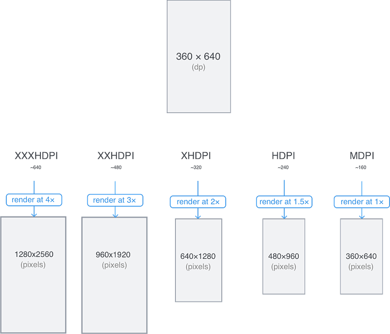
sp - Scale-independent Pixels — This is like the dp unit, but it is also scaled by the user’s font size preference. It is recommend you use this unit when specifying font sizes, so they will be adjusted for both the screen density and the user’s preference.
PT - Point(PT) is an Apple thing for DP. Points are also resolution-independent measurement. Depending on the screens pixel density, a point can contain multiple pixels.
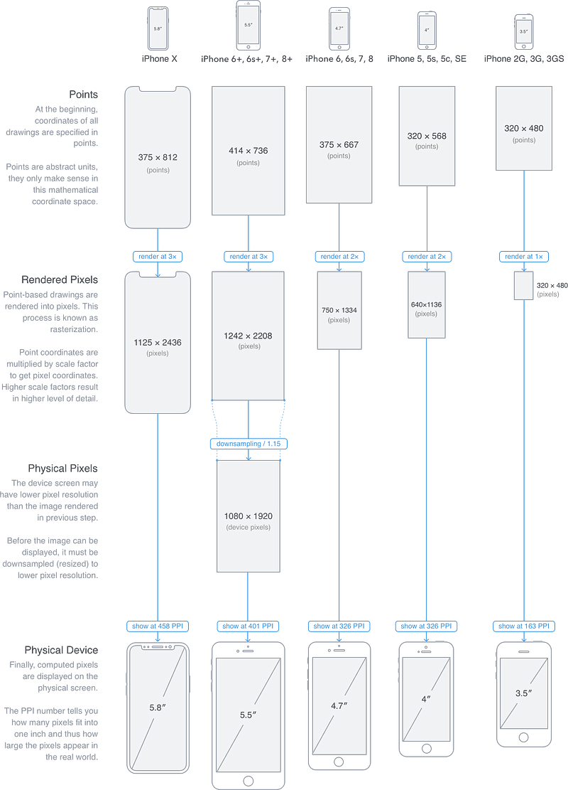
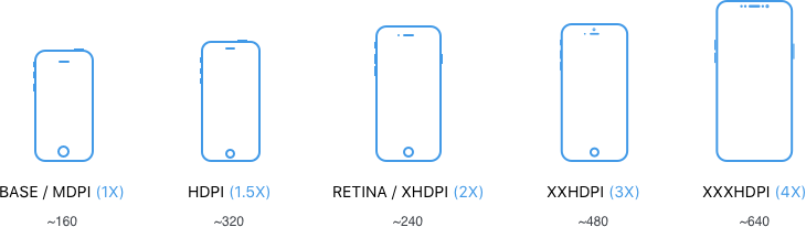
While designing start at 1x scale, then scale up to various higher pixel densities at the time of exporting. If we design at a device’s final pixel dimensions (2x, 3x, etc.) it will lead to trouble during exporting. Because scaling a 2x graphic 150% to generate a 3x graphic produces blurry results, but scaling a 1x graphic 200% and 300% retains visual clarity.
Next in the series Mobile App Design: Part 2 ( Understanding the 8pt grid)